Friday, April 23, 2010

Cartographic Animation

Cartographic animations allow spatial visualization. It is used for the depiction of change over time. For example, we watch radar when checking a hurricane status and the animation shows how the hurricane will move.
http://www.mthurricane.com/Hurricane_Charley.htm

Starplot

A star plot is a graphic representation of the relative behavior of all variables in a multivariate data set
http://www.itl.nist.gov/div898/handbook/eda/section3/starplot.htm

Correlation matrix

A correlation matrix describes correlation among sets of variables. It is always symmetric because the correlation between Xi and Xj are the same as the correlation between Xj and Xi http://yin.che.wisc.edu/images.htm

Similarity Matrix

A similarity matrix is a matrix made of scores that show similarity between two data points. http://tomcat.esat.kuleuven.be/txtgate/tutorial.jsp

Stem and Leaf

Stem and leaf plots show the frequency with which certain classes of values occur. These values in turn can be used to create a histogram.
http://www.uow.edu.au/student/attributes/statlit/modules/module2/shapedist.html

Box Plot

A boxplot compares sets of data through a 5 point summary.
http://www.lohninger.com/boxplot.html

Histograms

A histogram is a table that displays info as adjacent rectangles. Each rectangle is shown over an interval, with an area equal to the frequency of the interval. The height is equal to the frequency density of that interval.
http://cs.anu.edu.au/escience/lecture/cg/CGIntroduction/printCG.en.html

Parallel Coordinate Graph


Parallel coordinate maps show large sets of data that contain many variables. One line in the parallel will connect a series of variables of different values.

http://vis.lbl.gov/Events/SC07/Drosophila/

Triangular Plot

A triangular plot is based on three variables. It depicts the ratios of the three variables as positions on a equilateral triangle.

http://www.ex-parrot.com/~chris/wwwitter/20050407-it_doesnt_matter_how_you_vote_either_way_your_planet_is_doomed.html

Windrose

A windrose depicts how wind speed and direction are distributed at a particular location.
http://lion.cs.uiuc.edu/projects/wsn_ornl.html

Climograph

A climograph is a graph that displays the monthly precipitation and temperature of a given place. Precipitation is shown as a bar graph, and temp is a line graph.

http://www.washburn.edu/faculty/tfry/Climate%20article.htm

Population Proflle

A population profile shows trends in populations over time. Variables can inlclude sex, age, and any other attribute they are wanting to compare. The one i have chosen shows people with AIDS

http://www.ifad.org/operations/regional/pf/aids_1.htm

Scatterplot


A scatterplot uses Cartesian coordinates to display values for two variables for a set of data. It is displayed as a set of points each one has a value of one variable determining the position on the horizontal, while the other variable determines position on the vertical axis.
http://www.army.mil/ArmyBTKC/focus/cpi/tools3.htm

Index value plot

An index value plot is a visualization. It will help to show discrepancies within information. It can also show performance of data over a period of time.

http://waterwatch.usgs.gov/?m=real&r=nc&w=real%2Cplot

Lorenz Curve

A lorenz curve is a representation ofa a cumulative distribution function. This is probability distribution of wealth. In the geography realm it is used to study biodiversity.
http://faculty.lebow.drexel.edu/McCainR//top/prin/txt/factors/dist3.html

Bilateral Graph

A bilateral graph shows changes on either side of a value of zero, and compares two or more sets of data.

http://www.mofa.go.jp/policy/oda/category/environment/pamph/2001/oda.html

Nominal Area Chorpleth

Nominal area choropleth are used to display nominal data in a specific region. This is data within categories like race, political party, and ethnicity.

www.stat.columbia.edu/~cook/movabletype/archives/2007/10/some_cool_graph.html

Unstandardized Choropleth Map

Unstandardized choropleths use raw data as opposed to averages. Information represents a total value.

http://www.sitemaker.umich.edu/356.haas/files/us_map.jpg

Standardized Choropleth

Standardized choropleths use data that is averaged by area. This can be presented as densities or percentages.

http://www.statcan.gc.ca/pub/92f0138m/2008003/figures/5200001-eng.htm

Univariate

A thematic map using and displaying one set of data.
www.cdc.gov/pcd/issues/2007/oct/07_0091.htm

Bivariate Choropleth

Bivariate maps display two variables on a single map by combining two different sets of graphic symbols or colors.
http://www.geog.ucsb.edu/~jeff/gis/choropleth_maps.html

Unclassed Choropleth

An unclasssed choropleth map shows statistical data in color values moving from light to dark with light colors portraying smaller values.
http://www.esds.ac.uk/international/support/user_guides/gisoverview.asp#choropleth

Classed Cloropleth

A classed cloropleth map gives varying statistics that occur within specific boundaries.
http://indiemaps.com/blog/2009/11/the-first-thematic-maps/

DEM

A DEM is a digital elevation model. This is a digital representation of a ground service. Meaning the topography or the terrain. It can also be called a digital terrain model.
http://terrain.cs.duke.edu/grid/graphics/OrangeCntyNC_DEM_big.jpg

DLG


A DLG is a digital line graph, it shows coordinates in vector form.

http://ga.water.usgs.gov/olympics/athens.dlg.gif

DRG

DRG is a digital raster graphic, this is a scanned image of a US Geological Survey. Usually done from a topographic map. Position accuracy will usually match the source map
http://www.fao.org/DOCREP/003/T0446E/T044649.gif

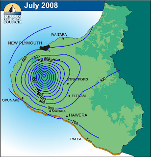
Isopleths

Isopleths are lines that connect units of equal distance. On maps they can be used for mapping elevation, precipitation or any other of a number of measurements.

http://www.fao.org/DOCREP/003/T0446E/T044649.gif

Isotachs


Isotach maps show wind speed. By definition an isotach is a line connecting points of equal wind speed

www4.ncsu.edu/~nwsfo/storage/cases/20030123/small.eta_12z_300_000hr.gif

Isopach

Isopach maps display thickness. These contours connect points of equal thickness. This is commonly thickness of a rock unit, being the stratigraphic thickness as opposed to vertical thickness
www4.ncsu.edu/~nwsfo/storage/cases/20030123/small.eta_12z_300_000hr.gif

Isoyhet


Isoyehts show precipitation amounts. An isohyet is a line connecting points of equal precipitation amounts.

www4.ncsu.edu/~nwsfo/storage/cases/20030123/small.eta_12z_300_000hr.gif

Isobars


An isobar is a line of constant pressure on a graph or map. Isobars are lines drawn on a map joining places of equal average atmospheric pressure reduced to sea level.

http://www.newmediastudio.org/DataDiscovery/Hurr_ED_Center/Hurr_Structure_Energetics/Closed_Isobars/Closed_Isobars_fig02.jpg

LIDAR

LIDAR is light detecting and ranging. This is a remote sensing technology that measures scattered light to find a range or other information about a certain target.
http://www.icrest.missouri.edu/Sensors/

Doppler

Doppler radar usese the doppler effect to get velocity data about objects that are at a distance. This is done by beaming a microwave towards a target and listening for the reflection
http://www.weatherusa.net/blog/images/doppler-orlando-1943.gif

Black and White Aerial

Black and white aerial photos are used in relation to surveying a certain area of land.
http://ecosystems.mbl.edu/pie/data/MAP/irparker.jpg

Infrared Aerial

Infrared aerial photography is used to document changes in the environment. It can also be used to see structural damages to buildings, and insects
http://www.aerialarchives.com/Aerial-Maps-of-Sonoma-County.htm

Statistical Map

A statistical map givea a statistic of the time course over a a specificed set of time periods. This can measure things such as rainfall, population or who is on the internet, as in my example.
http://www.arabdev.org/map

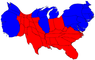
Cartogram

A cartogram is a map where the variable being shown is substituted for land area. This distorts the geometry of the map.
http://politicalmaps.org/2004-presidential-election-maps/

Flow Map

A flowmap shows movement of objects from one location to another. This could be anything from people to goods, or in my example airplanes.
http://your.kingcounty.gov/airport/pilots/fly_quiet.stm

Isolines

An isoline of a function of two variables is a curve along which the function has a constant value. This is also known as a contour map, where the contour is the interval is the distance between contour lines.
http://www.unu.edu/unupress/unupbooks/80157e/80157E0T.GIF

Proportional Circle Map

A proportional circle map gives data through the use of circles. The larger the circle is the higher the proportion of data is.
http://mapmaker.rutgers.edu/355/dotProporCircle.jpg

Choropleth Map


A choropleth map is a type of thematic map. It uses shades or patterns in proportion to the measurement of a statistic. It provides an easy way to visualize how a measurement varies across a geographic region.

http://my.ilstu.edu/~jrcarter/Geo204/Choro/Tom/

Dot Distribution Maps

Dot distribution maps show where data characteristics occur. They use dots to show the number of occurances ina a particular location. This is particularly handy in studying population.
http://aede.osu.edu/programs/exurbs/Maps2/tshippop1.jpg

Propaganda Maps

A propaganda map is often used by government officials to try to sway the way people think. They will take something that is real, and configure it in such a way that it will cause an individual to think differently about something that is going on in the world around us. The one I have chosen is based on what was taking place during the 80's and how President Reagan may have saw the world around him.

http://strangemaps.wordpress.com/2006/11/23/38-the-world-according-to-ronald-reagan/

Hypsometric


Hypsometric maps are also called relief maps. What they do is show the elevation of a an area of land. They do this by using a succession of colors. The colors vary based on certain intervals of land elevation. They usually use the rule of "higher is brighter" meaning that the darker the color the higher the terrain.

http://www.trailcanada.com/canada/map/relief/

PLSS Map


PLSS is Public Land Survey Systems. This is used to survey and identify land parcels, usually for deeds tor rural or wild areas. It is often known as the rectangular survey system, although non rectangular methods can be used.

http://www.fgdc.gov/library/whitepapers-reports/annual%20reports/2008/web-version/AppendixC.html

Cadastral Map


A cadastral map shows boundary and ownership of specific parcels of land. It has been said that the cadastral map makes a place tangible to the outsider. It also allows states and towns to collect data on their subjects. It often includes street names and lot numbers. The map I have chosen is a portion of Washington DC

http://www.dcvote.org/trellis/character/maps/45.jpg

Thematic Map


A thematic map is specially designed to specifically address a certain theme within a geographic area. This can be physical, social, political, cultural, economical or any other aspect of a given region.

http://www.mapsunlimited.com/sample/BBBNAmap.html

Planimetric Map


A planimetric map shows only the horizontal positions of things on the earths surface. This is in contrast to the topographic which gives horizontal and vertical. These maps will show buildings, highways, reservoirs, docks, piers, bridges and other pieces of construction or features. The map I have chosen is of a hospital.

http://www.spatialdc.com/projects/hospitals.htm
Topographic Map


A topographic map uses large scale images and detail. It will usually give representation of relief using contour lines,but this can be done in a variety of ways. Topographic maps usually include both natural and man made features.

http://www.mapsofindia.com/maps/schoolchildrens/topographic.htm