Friday, April 23, 2010

Cartographic Animation

Cartographic animations allow spatial visualization. It is used for the depiction of change over time. For example, we watch radar when checking a hurricane status and the animation shows how the hurricane will move.
http://www.mthurricane.com/Hurricane_Charley.htm

Starplot

A star plot is a graphic representation of the relative behavior of all variables in a multivariate data set
http://www.itl.nist.gov/div898/handbook/eda/section3/starplot.htm

Correlation matrix

A correlation matrix describes correlation among sets of variables. It is always symmetric because the correlation between Xi and Xj are the same as the correlation between Xj and Xi http://yin.che.wisc.edu/images.htm

Similarity Matrix

A similarity matrix is a matrix made of scores that show similarity between two data points. http://tomcat.esat.kuleuven.be/txtgate/tutorial.jsp

Stem and Leaf

Stem and leaf plots show the frequency with which certain classes of values occur. These values in turn can be used to create a histogram.
http://www.uow.edu.au/student/attributes/statlit/modules/module2/shapedist.html

Box Plot

A boxplot compares sets of data through a 5 point summary.
http://www.lohninger.com/boxplot.html

Histograms

A histogram is a table that displays info as adjacent rectangles. Each rectangle is shown over an interval, with an area equal to the frequency of the interval. The height is equal to the frequency density of that interval.
http://cs.anu.edu.au/escience/lecture/cg/CGIntroduction/printCG.en.html

Parallel Coordinate Graph


Parallel coordinate maps show large sets of data that contain many variables. One line in the parallel will connect a series of variables of different values.

http://vis.lbl.gov/Events/SC07/Drosophila/

Triangular Plot

A triangular plot is based on three variables. It depicts the ratios of the three variables as positions on a equilateral triangle.

http://www.ex-parrot.com/~chris/wwwitter/20050407-it_doesnt_matter_how_you_vote_either_way_your_planet_is_doomed.html

Windrose

A windrose depicts how wind speed and direction are distributed at a particular location.
http://lion.cs.uiuc.edu/projects/wsn_ornl.html

Climograph

A climograph is a graph that displays the monthly precipitation and temperature of a given place. Precipitation is shown as a bar graph, and temp is a line graph.

http://www.washburn.edu/faculty/tfry/Climate%20article.htm

Population Proflle

A population profile shows trends in populations over time. Variables can inlclude sex, age, and any other attribute they are wanting to compare. The one i have chosen shows people with AIDS

http://www.ifad.org/operations/regional/pf/aids_1.htm

Scatterplot


A scatterplot uses Cartesian coordinates to display values for two variables for a set of data. It is displayed as a set of points each one has a value of one variable determining the position on the horizontal, while the other variable determines position on the vertical axis.
http://www.army.mil/ArmyBTKC/focus/cpi/tools3.htm

Index value plot

An index value plot is a visualization. It will help to show discrepancies within information. It can also show performance of data over a period of time.

http://waterwatch.usgs.gov/?m=real&r=nc&w=real%2Cplot

Lorenz Curve

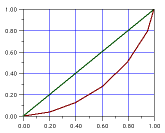
A lorenz curve is a representation ofa a cumulative distribution function. This is probability distribution of wealth. In the geography realm it is used to study biodiversity.
http://faculty.lebow.drexel.edu/McCainR//top/prin/txt/factors/dist3.html

Bilateral Graph

A bilateral graph shows changes on either side of a value of zero, and compares two or more sets of data.

http://www.mofa.go.jp/policy/oda/category/environment/pamph/2001/oda.html

Nominal Area Chorpleth

Nominal area choropleth are used to display nominal data in a specific region. This is data within categories like race, political party, and ethnicity.

www.stat.columbia.edu/~cook/movabletype/archives/2007/10/some_cool_graph.html

Unstandardized Choropleth Map

Unstandardized choropleths use raw data as opposed to averages. Information represents a total value.

http://www.sitemaker.umich.edu/356.haas/files/us_map.jpg

Standardized Choropleth

Standardized choropleths use data that is averaged by area. This can be presented as densities or percentages.

http://www.statcan.gc.ca/pub/92f0138m/2008003/figures/5200001-eng.htm

Univariate

A thematic map using and displaying one set of data.
www.cdc.gov/pcd/issues/2007/oct/07_0091.htm